Krew Outfitters Brand Identity
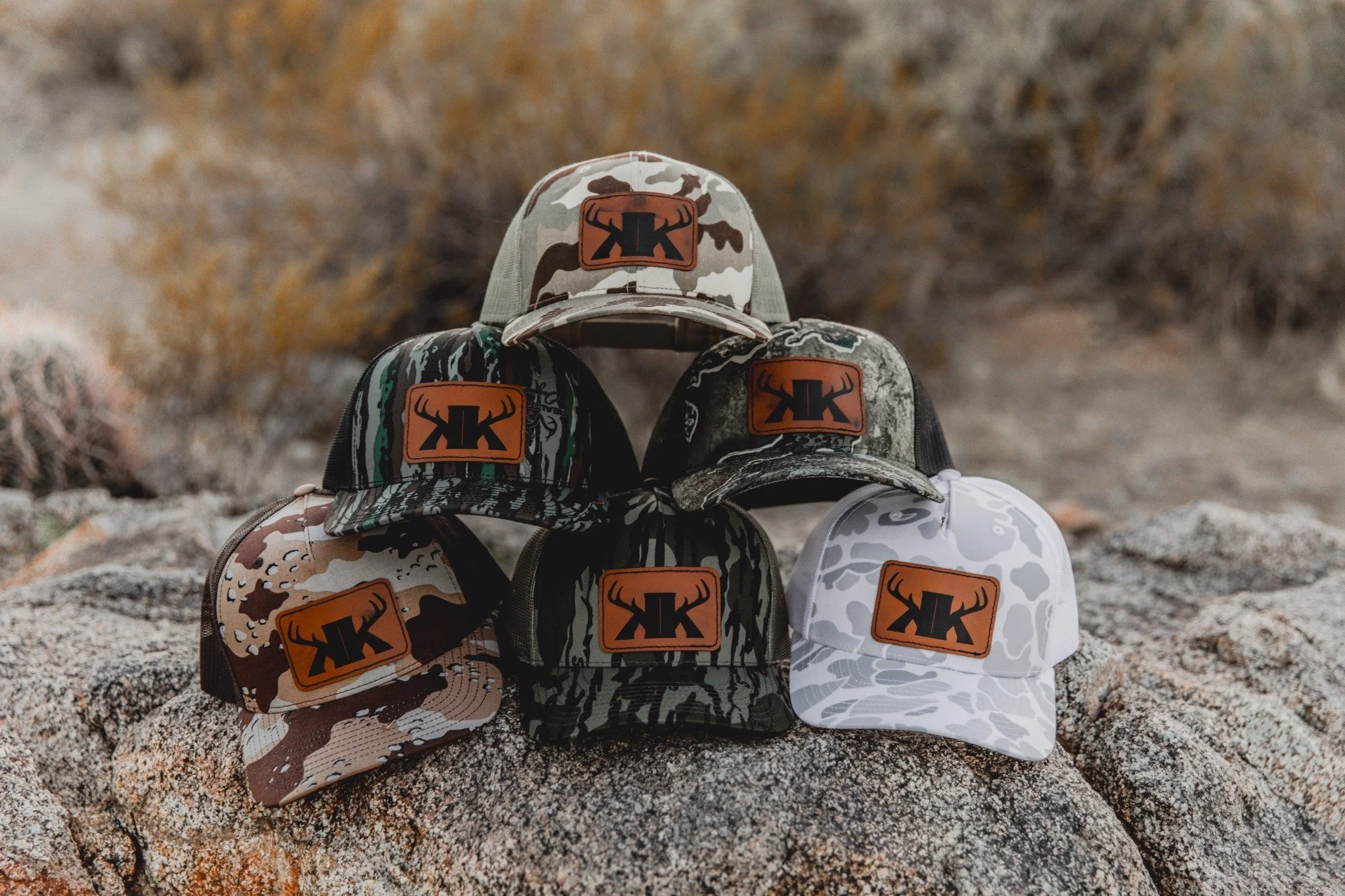
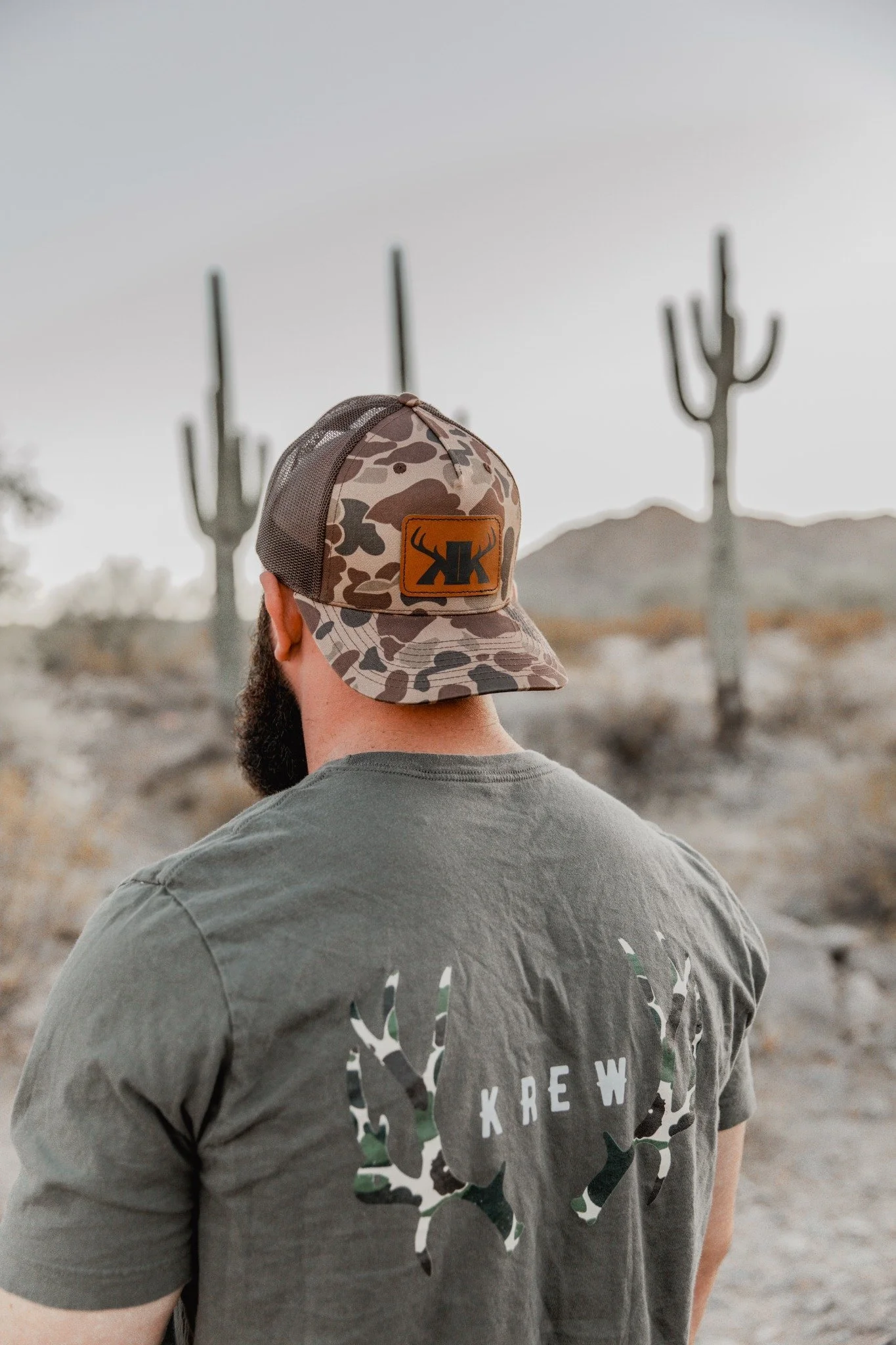
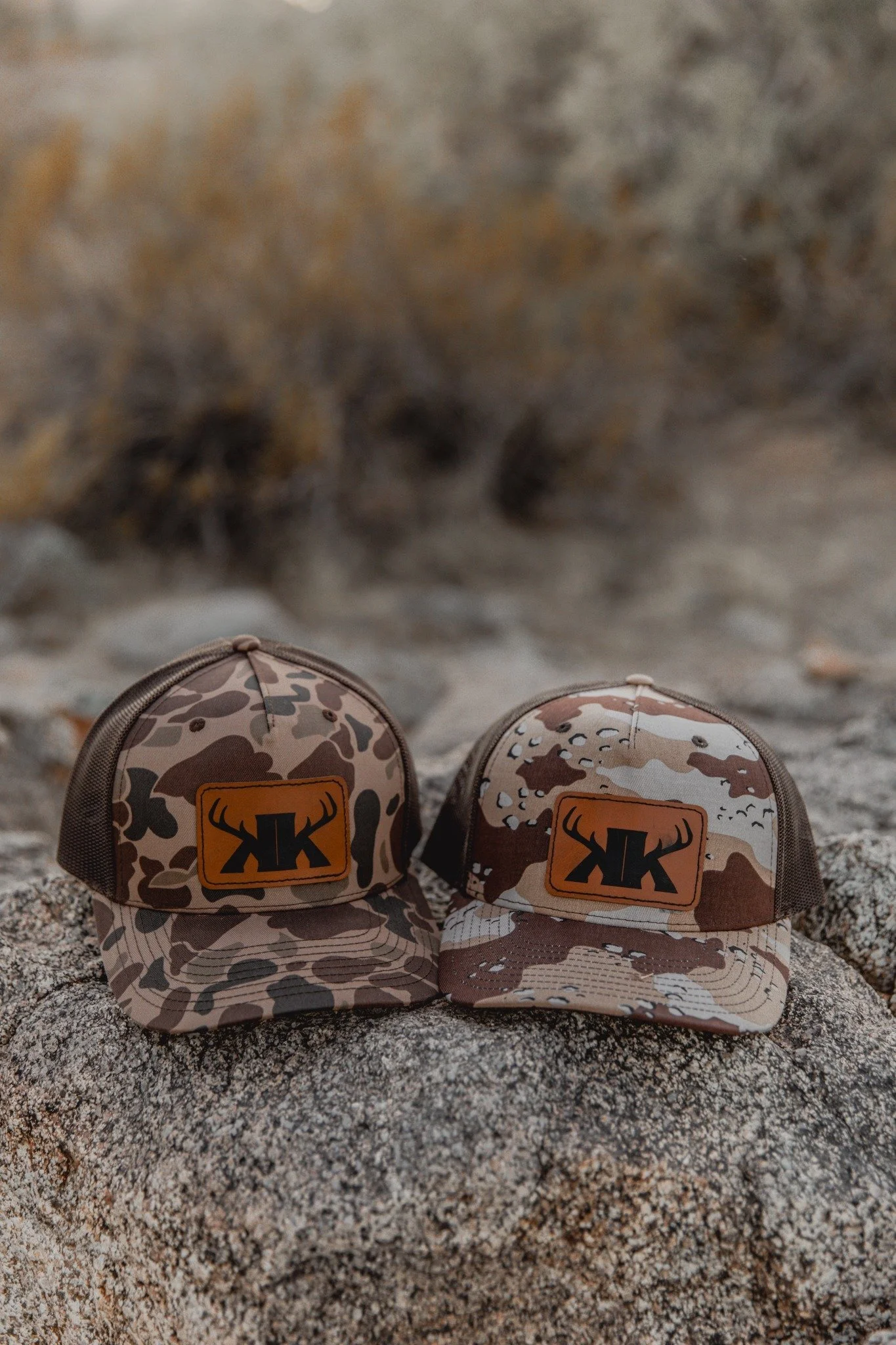
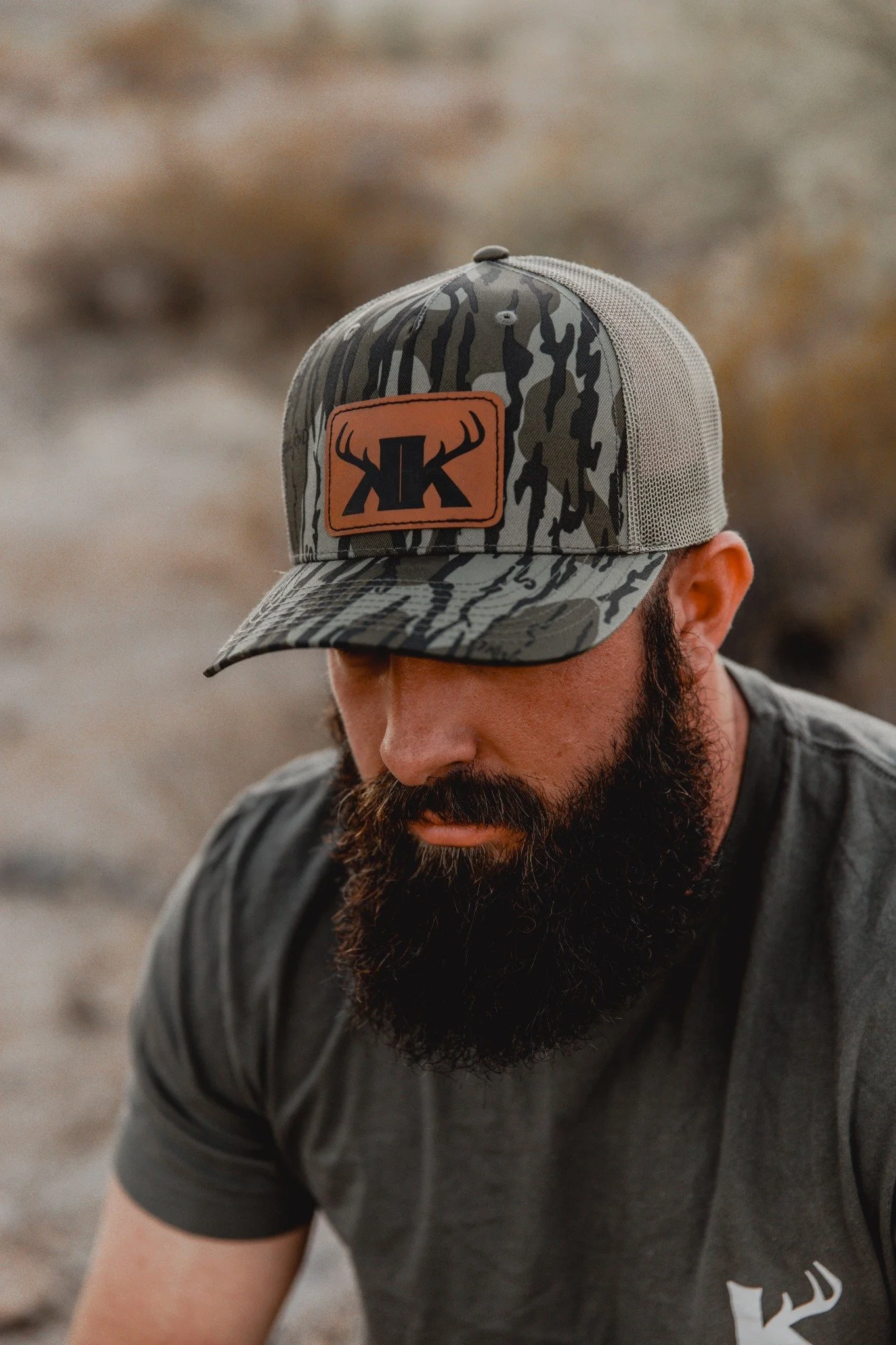
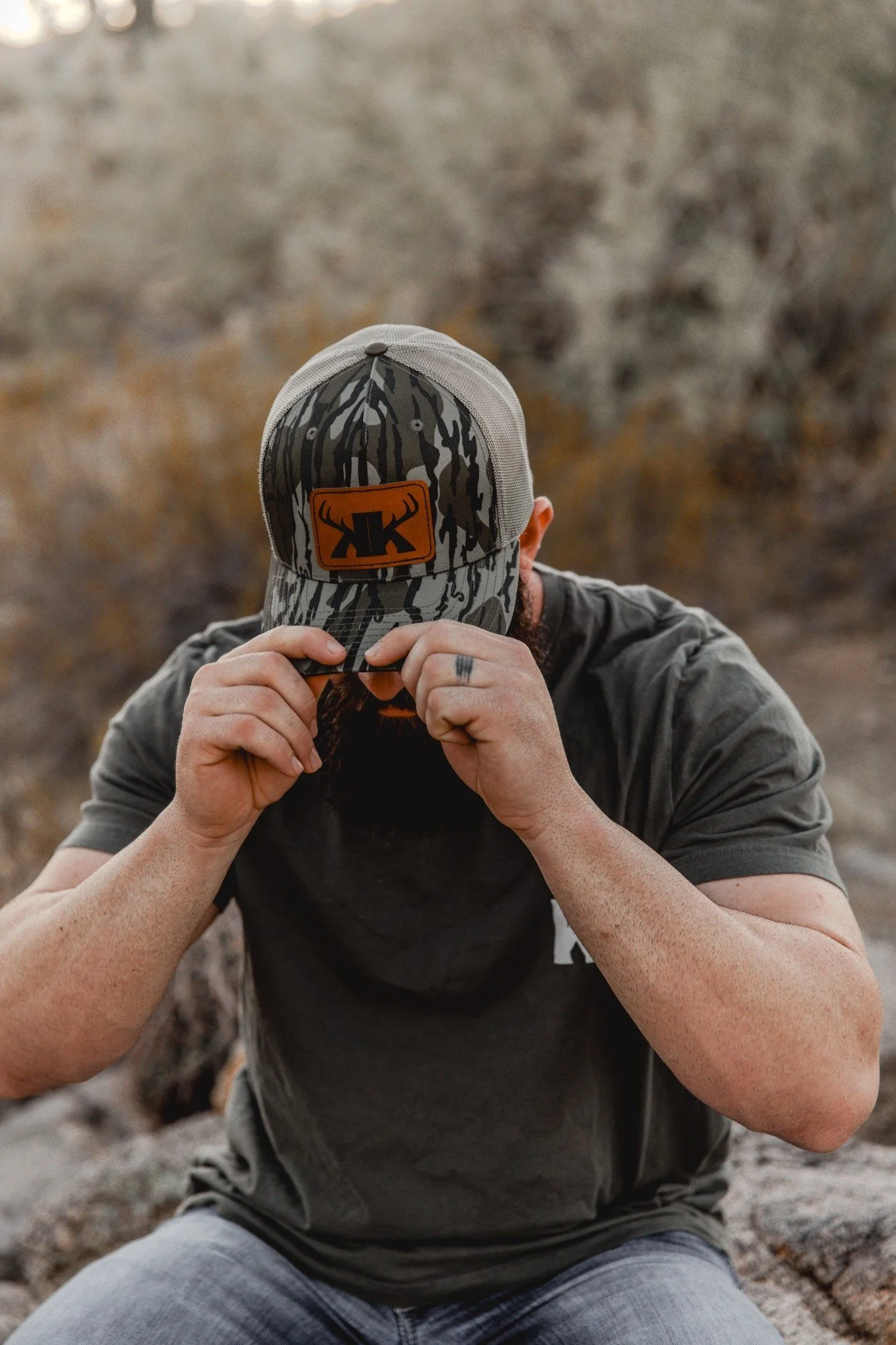
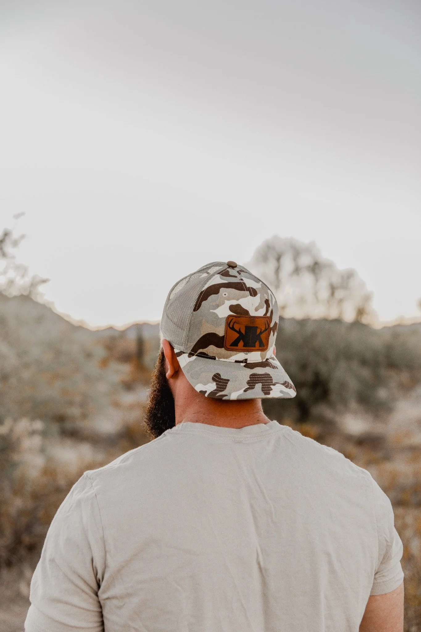
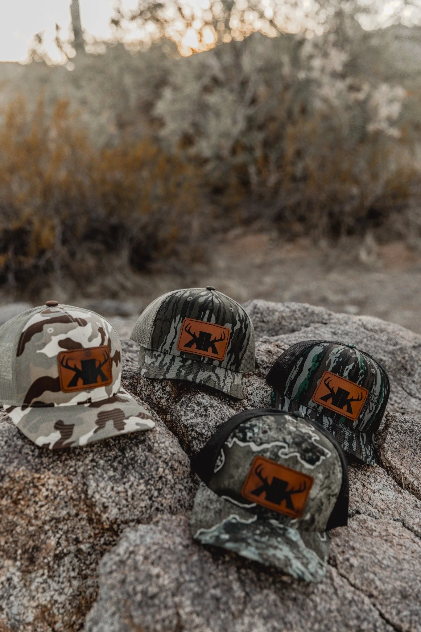
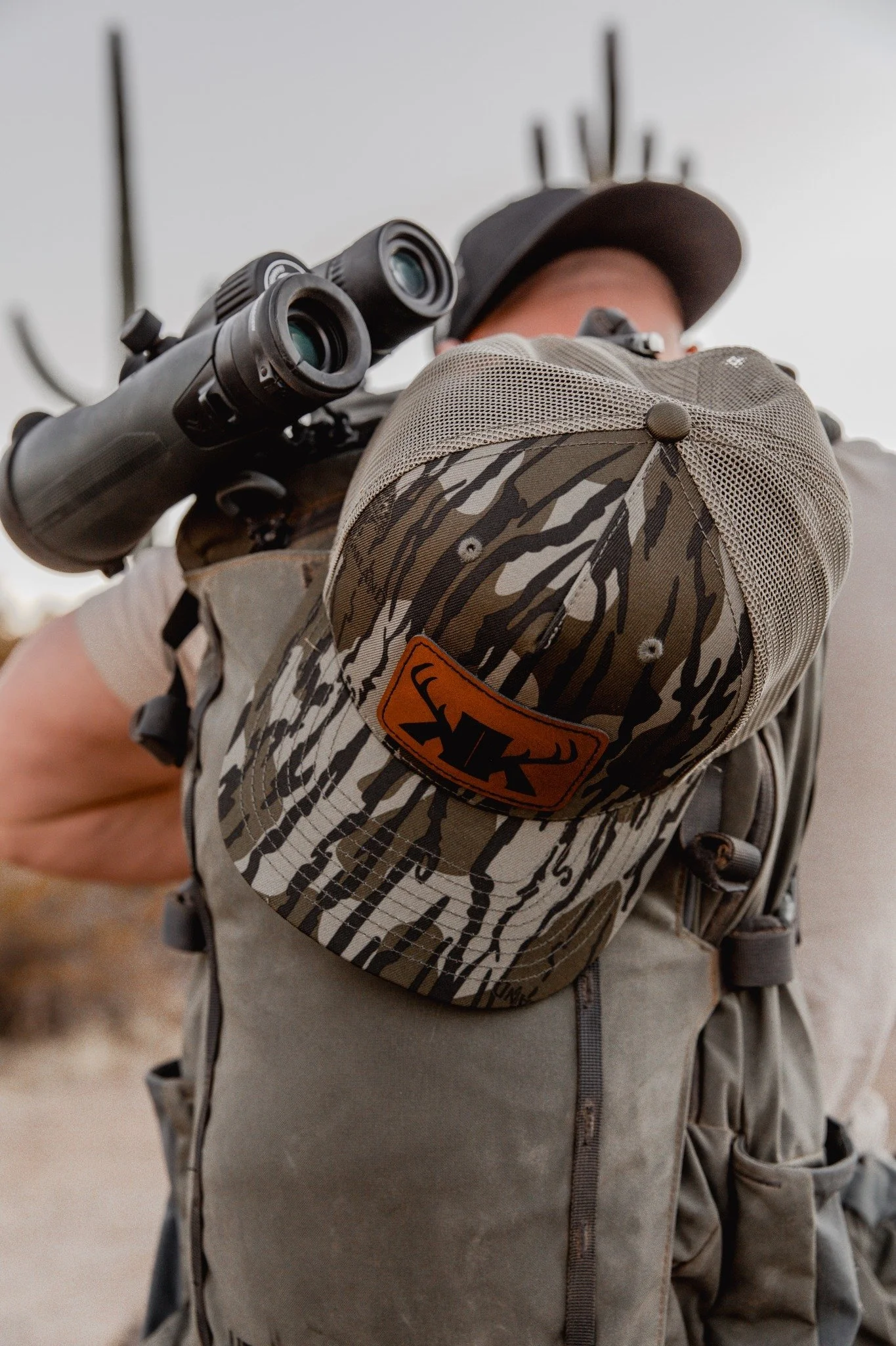
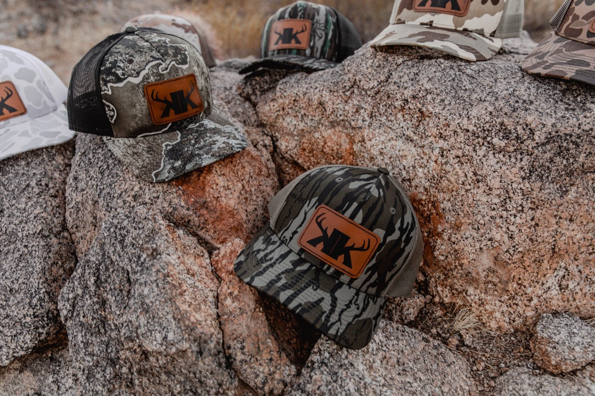
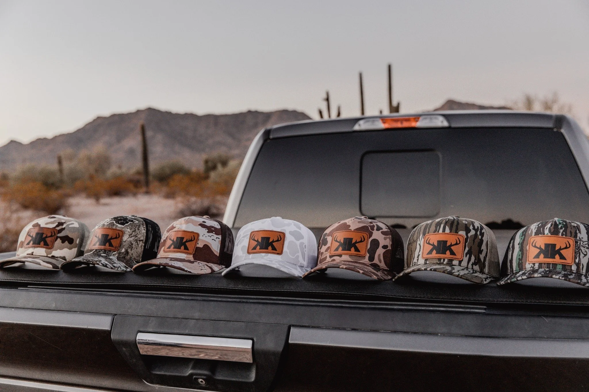
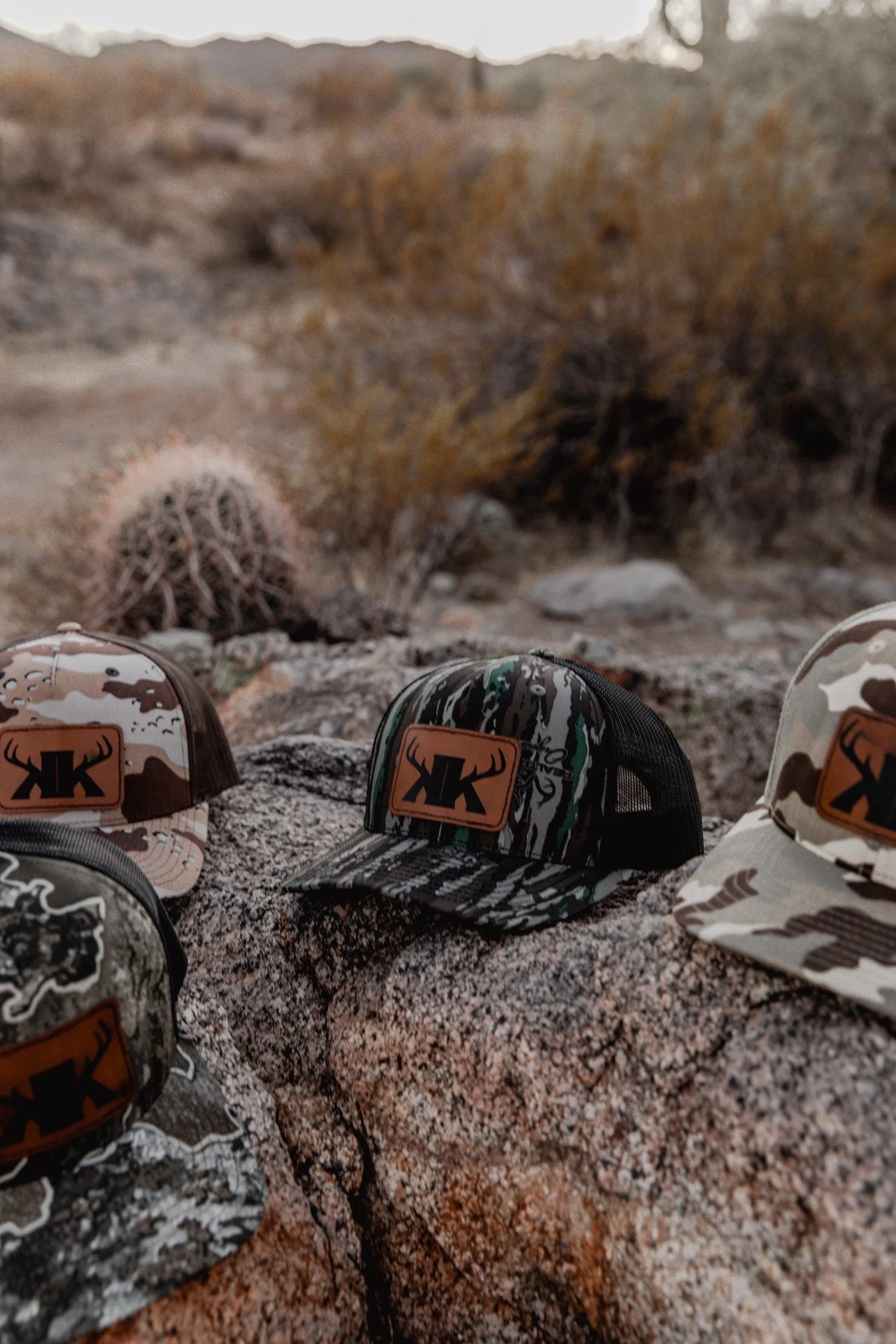
Krew Outfitters is a new hunting and fishing outdoor apparel company who wants to be known by the outdoor community, providing everyday wear to show what they love. Founder Jake Knudsen tasked us with creating a branding experience that focused on his values, felt professional and was able to become a memorable brand. Through a unique color palette, and typography, we created a cohesive brand identity that brought life to Krew Outfitters.
Scope
— Discovery
— Typography, Color
— Logo System
— Brand Guidelines
Wordmark
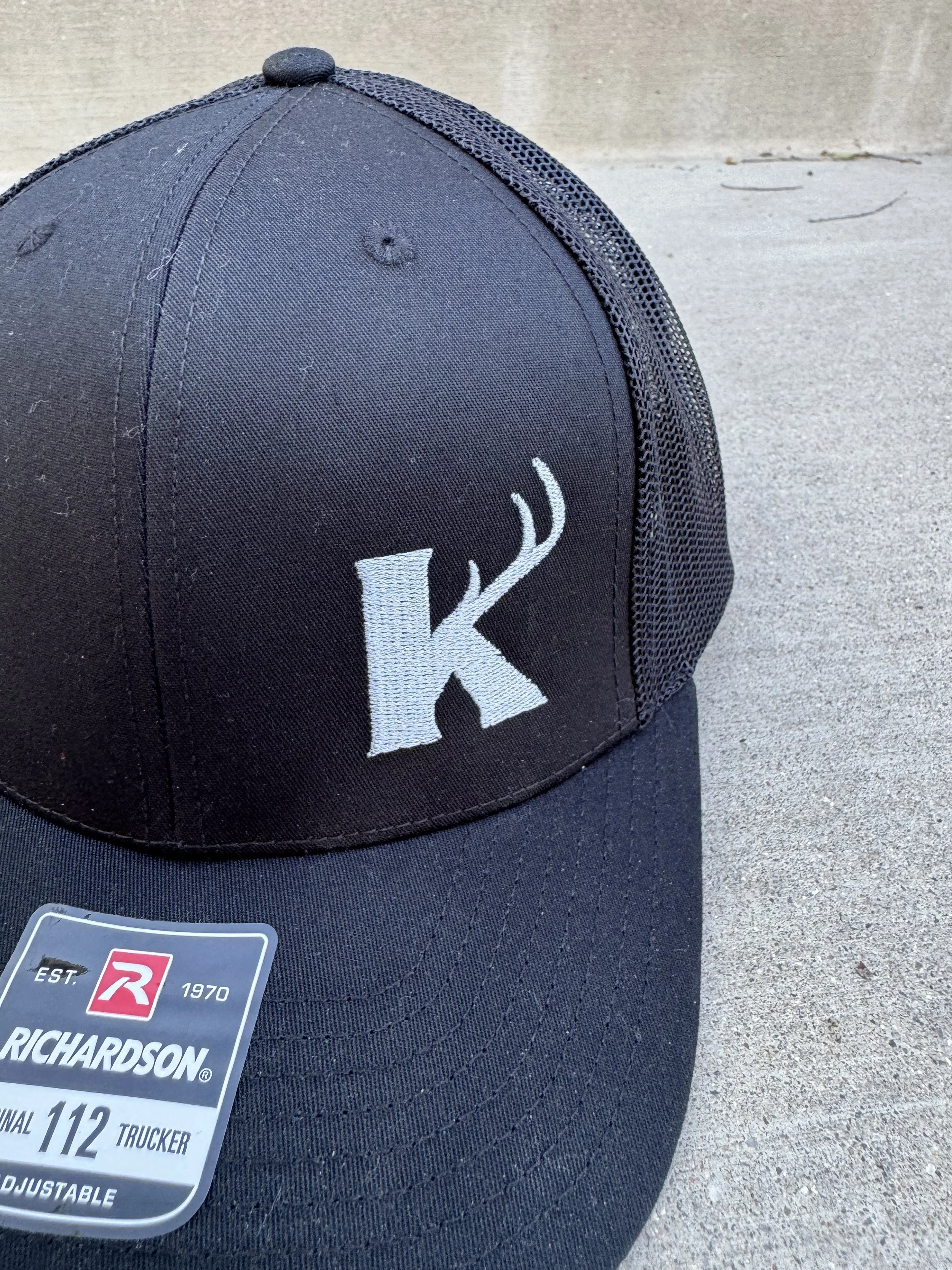
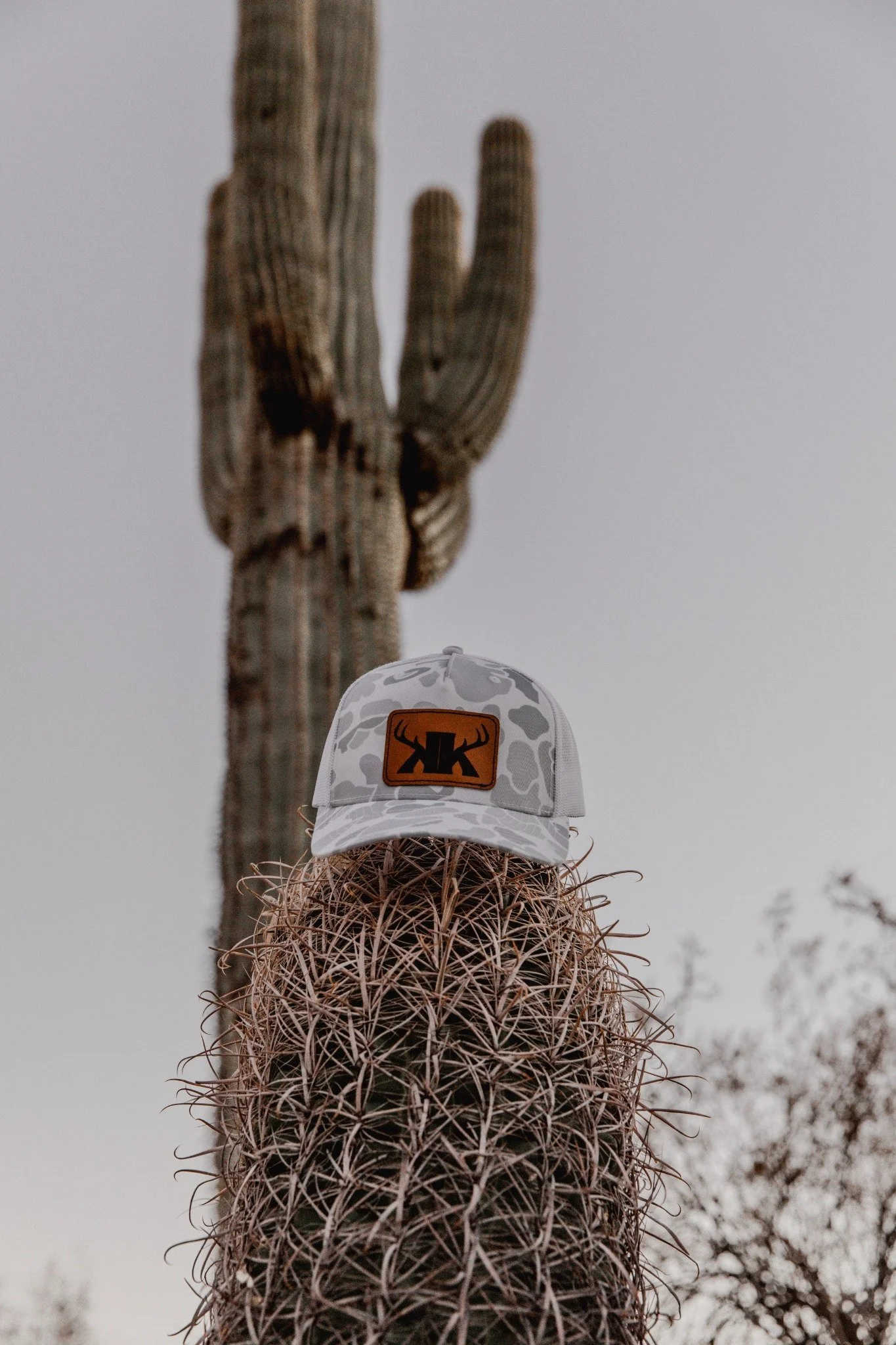
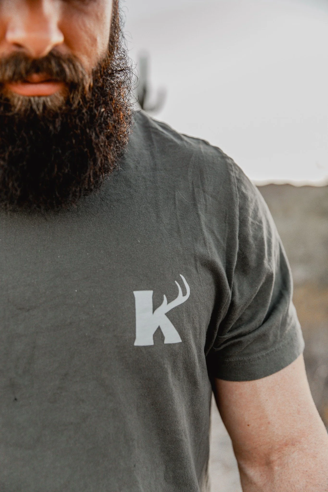
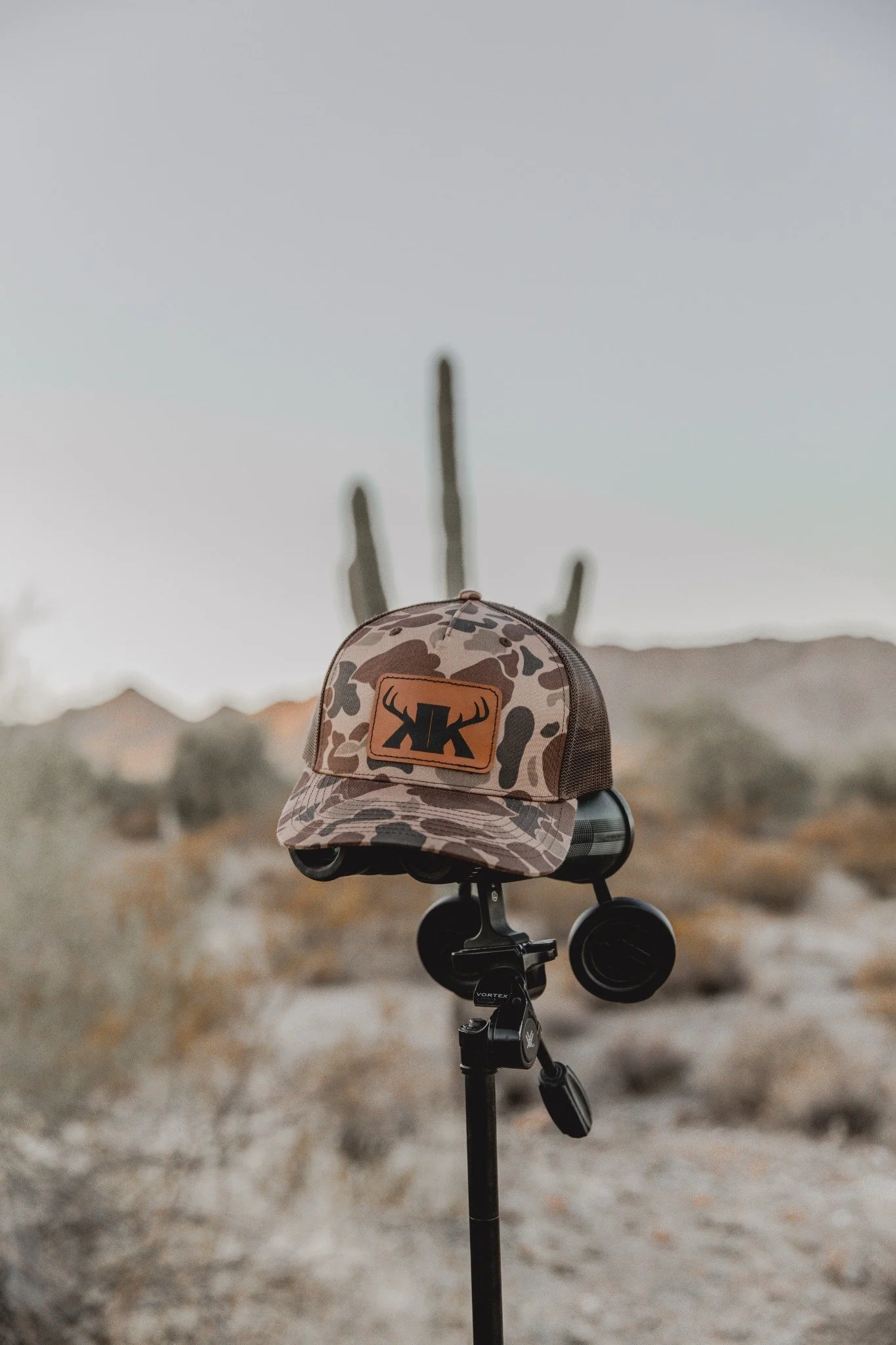
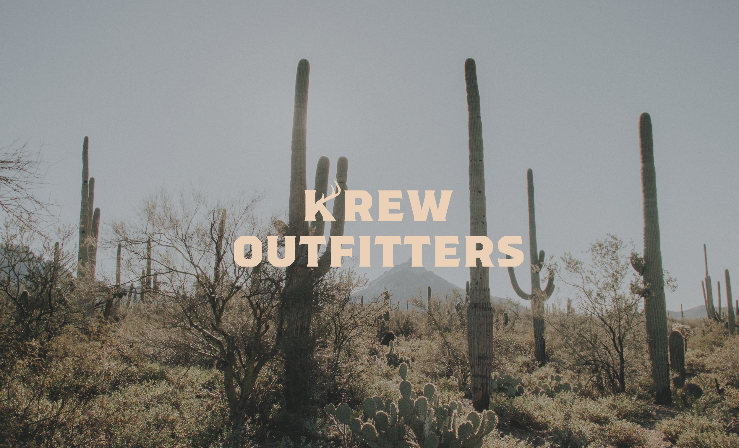
A custom-made wordmark that features adventurous, sharp type with unique characteristics. The "K" has been transformed into an antler while still being readable as an "K" this makes the mark feel more memorable.

Color & Type:
We selected color and type that felt unique compared to other outdoor brands. Something bold and professional. The Krew Outfitters color palette is inspired by nature and the colors seen in the wild. For headlines and subheadings we use a typeface called Degular. For body copy, we use a pleasant sans-serif typeface named Proxima Nova.


