Copper Bean Coffee Brand Identity
From day one, Copper Bean Coffee in Globe, Arizona set out to create a welcoming, professional brand that would introduce quality coffee to both locals and passing travelers. But they knew they needed more than just a logo to stand out; they needed a cohesive brand identity that would resonate across every customer touchpoint.
Our mission was clear: to craft a branding experience that reflects the warmth of the local community while delivering a clean, contemporary aesthetic that grabs attention on the busy highway.
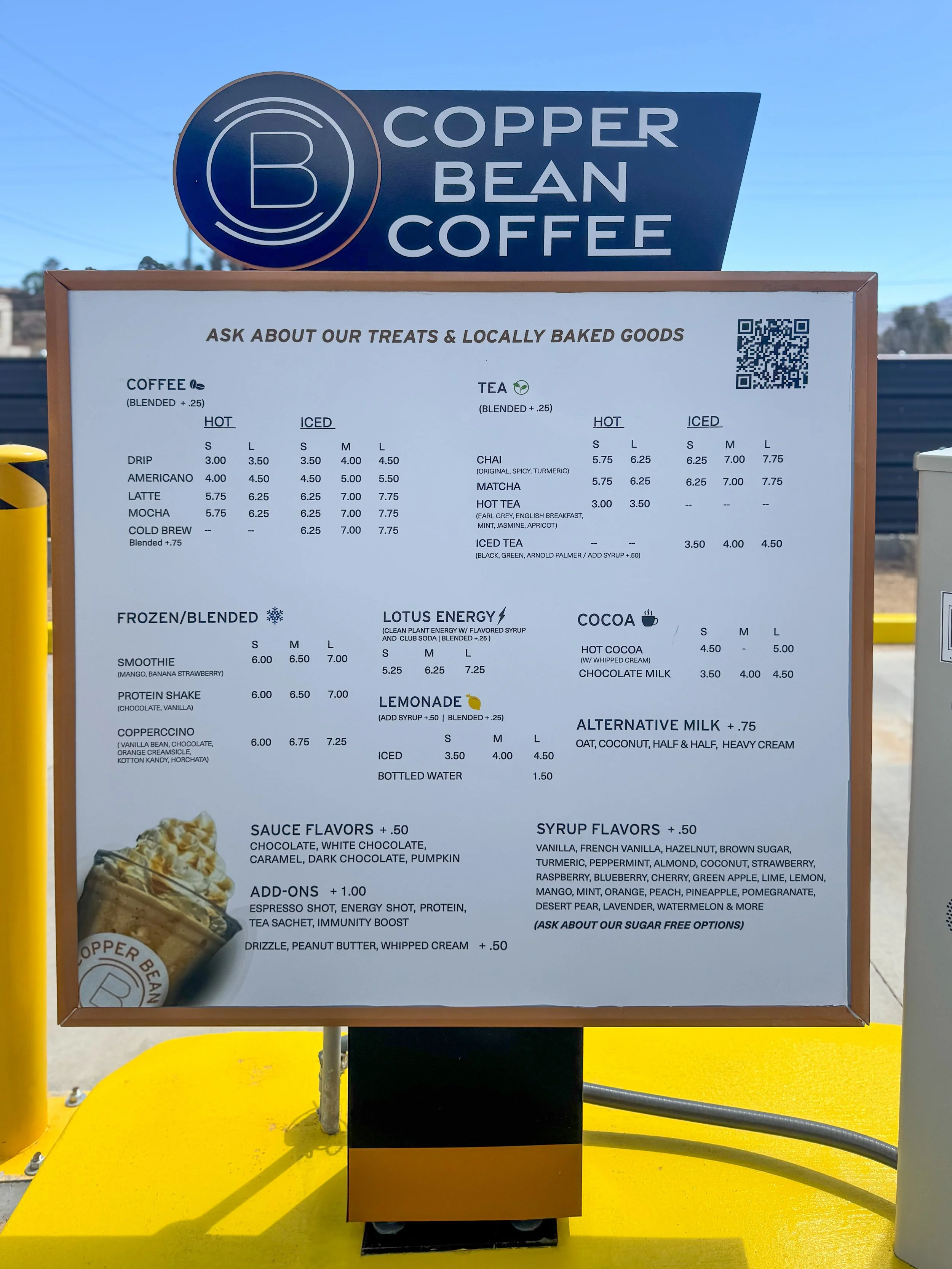
We executed the visual side of their grand plan by developing both the brand identity and the menu design. The result is a fresh, modern look that highlights Copper Bean Coffee’s commitment to quality and creates a great experience, one cup at a time.
Scope
— Identity System
— Typography, Color
Collateral: Menu

Logo System:
Our goal with the logo was to create a mark that felt both memorable and effortlessly versatile. The custom wordmark is a modern take on classic simplicity, balancing professionalism with approachability. The circular emblem reinforces the brand’s identity with a bold “B” framed by two stylized “C” shapes, subtly incorporating Copper Bean Coffee’s initials into a cohesive, recognizable symbol. This flexible design translates seamlessly across applications, from storefront signage to coffee cups, while a set of alternate logo variations offers additional ways to leave a mark on collateral, merchandise, and digital platforms.

Logos in use:
Watching Copper Bean Coffee bring their new identity to life across every aspect of their business was one of the most rewarding parts of this project. After delivering the final files, they seamlessly integrated the branding into staff uniforms, printed the logo on coffee cups, and proudly displayed it on the building’s exterior. Huge kudos to the Copper Bean Coffee team for elevating every detail of the brand experience.
Menu Design
In addition to the brand identity, we designed the menu board to be clean and visually aligned with the brand’s fresh, welcoming aesthetic. A clear layout and consistent typography highlight key offerings like Coffee, Tea, and Lotus Energy, while the monochromatic color scheme, subtle design accents, and product photography create a cohesive and visually appealing presentation. The design system is built for easy updates and adjustments as the shop grows, ensuring a consistent look across all applications.


